In this month’s design tutorial, we continue to explore the principles of graphic design. I have introduced you to the theories of hierarchy, emphasis, contrast and balance. This month, we explore repetition. Let’s get started.
Featured Image: Red Fleece Editorial Newspaper by Stephanie Toole licensed under CC By-NC-SA 3.0
What is Repetition?
Repetition is simply the process of repeating elements throughout a design, or several pieces of design collateral to give a unified look. You can think of it as adding consistency to a design.
How to apply Repetition
- Typefaces and fonts. Don’t go using many different fonts throughout a layout—use a maximum of three. A good habit to get into is to use typeface with a large family, or other words, ones that give you lot of different typestyles such as light, medium, bold, heavy etc.
- Patterns, lines and colours. Limit the different number of patterns, line weights/styles and colours used within a design and repeat throughout. For example, if you use several lines in a layout, keep the weight and style consistent.
- Images and Graphics. Try and keep the style of images and graphics the same. For example, use photos shot by the one photographer to help with consistency. Or, if you have applied a certain filter to an image, apply it to all of them.
- Grid system. A grid system can help develop consistency across a design with several pages, such as a book or magazine.
- Mixed collateral. If designing a number of items for the one event or business, they should all share a common look. For example, if designing a business card, letterhead and brochure for the one company, you should share design elements between each.
Examples of Repetition
The best way to see how to to successfully use repetition is to review some real world examples.
Travel Bureau MAGIC VOYAGE
This is a great example of how colour, typeface, shape and graphic style can be used to create repetition across singular and multiple pieces of design.
Travel Bureau MAGIC VOYAGE by Ingrafico Team & Katya Tch licensed under CC BY-NC 3.0
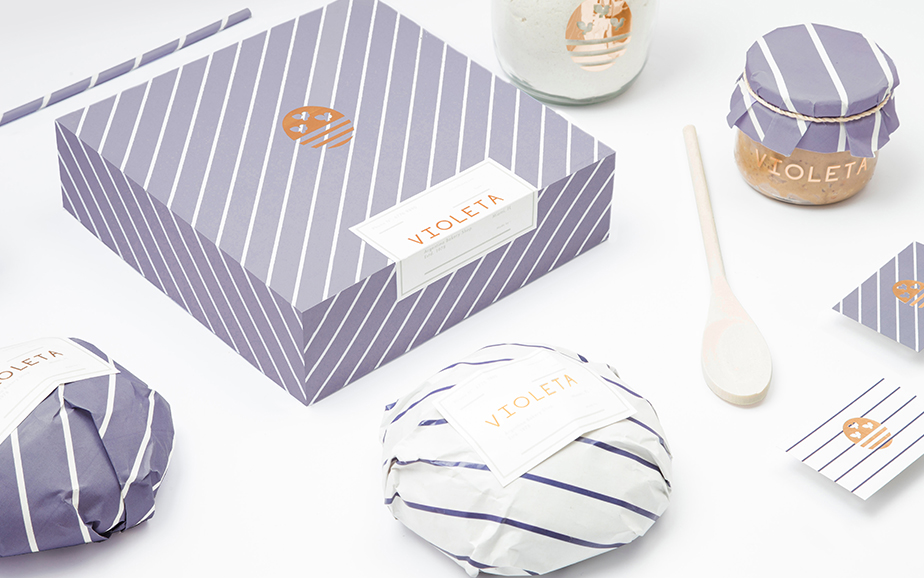
VIOLETAV
Line has been used to add repetition in this example. It is then repeated across all the design pieces to tie them together.
VIOLETA by Anagrama licensed under CC NY-NC 3.0
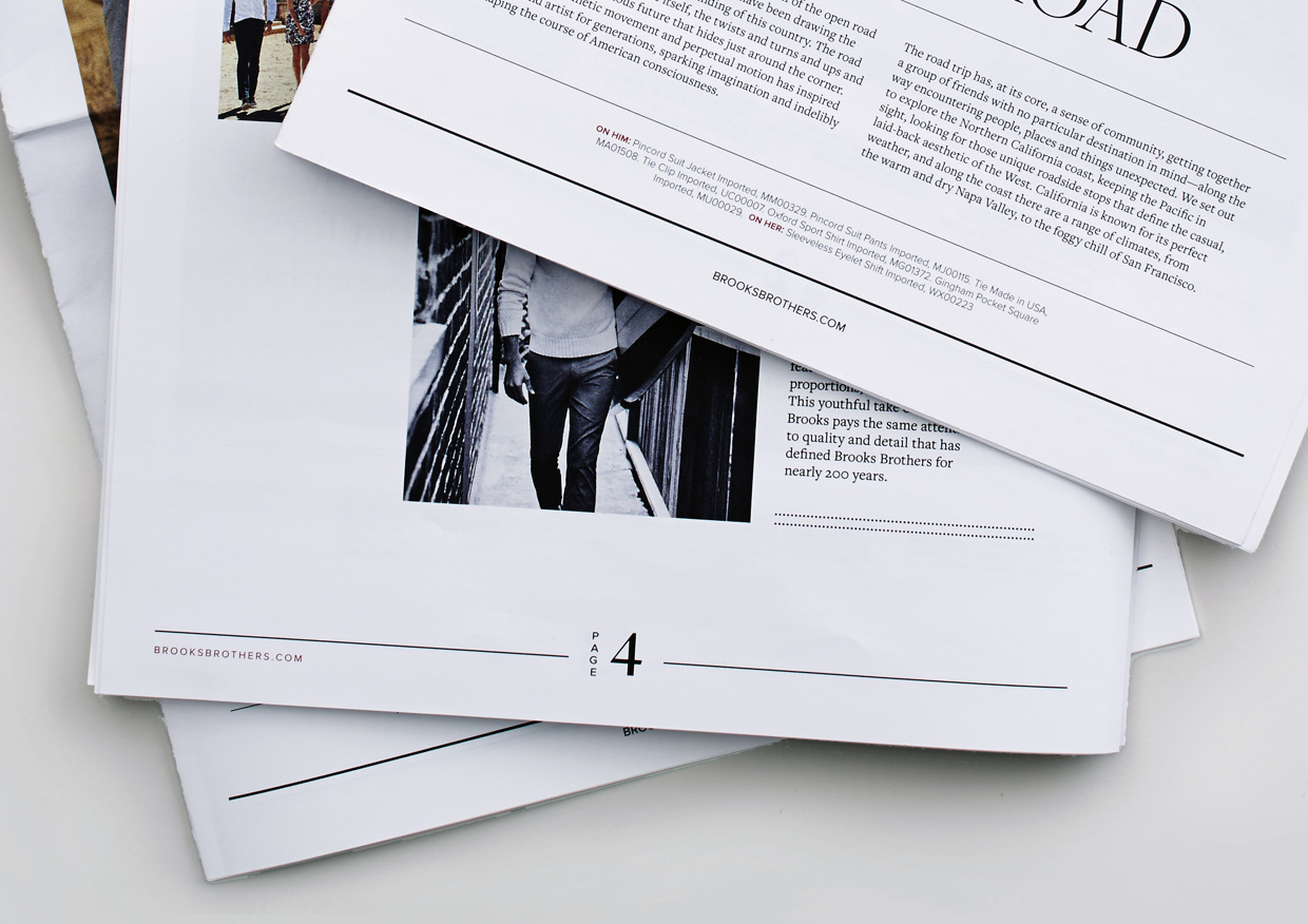
Red Fleece Editorial Newspaper
In this editorial design, the consistent use of line weight and style, typeface, white space and grid usage has added repetition throughout the entire layout.
Red Fleece Editorial Newspaper by Stephanie Toole licensed under CC By-NC-SA 3.0
Final Words
And that wraps up this month’s design article on repetition. I hope you enjoyed reading it.
Check out the other posts in this series:
The Principles of Graphic Design: How to Use Proximity Effectively
The Principles of Graphic Design: How to Use Balance Effectively
The Principles of Graphic Design: How to use Contrast Effectively
The Principles of Graphic Design: How to use Hierarchy and Emphasis Effectively
Other articles you may enjoy:
The Ultimate Guide to Typeface vs Font: When to Use Each Term.


